
- MULTIDISCIPLINARY DESIGN PORTFOLIO -

IAQPRO SmartAir
CPS PRODUCTS
(ENG)
For MML project the clients who are in the music industry wanted to create a platform for musicians to create sounds in an easy way. My role was to create the design elements for the project starting with the logo and moving along with all different design elements such as iconography, buttons, pictures and website. As a Sole designer I had to produce sketches, wireframes in high fidelity, define color palette, mockup layouts, branding and new assets.
.
TechMechs- MML/ UI & Graphic Designer Freelance Project (UI Architecture for a composer music platform) / (4 months) 2018
 UNDERSTANDING THE PROJECT'S CONCEPT |
|---|
The client was looking to create a music composer platform to allow musicians to create their own sounds with a user-friendly and interactive interface. The problem addressed through the platform is to create the first interactive music composer made by musicians for musicians, addressing all the needs for the industry.
As a sole designer for the project my responsibility encompasses all design aspects of the business. One thing to be noticed is that this project was focusing on UI/Visual design
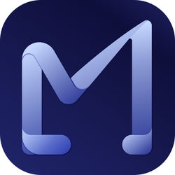
LOGO CREATION_
Part of the project was to create a logo that will symbolize the mission and purpose of the company.
My proposal explored different directions of design using illustrator as my principal tool. In some of the designs I took inspiration from the name of the logo, using the first letters to achieve a minimalistic isotype. In other cases I played around using some symbols of music with geometrical approaches.
At the end, along with the team we chose the design that represented a sense of simplicity, modernism and minimalism using clean and delicate lines resulting in a powerful logo that depicted the essence of the company.
 |  |  |
|---|---|---|
 |  |  |
 |  |
At the end, along with the team we chose the design that represented a sense of simplicity, modernism and minimalism using clean and delicate lines resulting in a powerful logo that depicted the essence of the company.
 FINAL LOGO PROPOSAL |
|---|
VISUAL LANGUAGE_
I created two distinctive moodboards to present the feelings targeting different user groups.
The first one was quiet, clean and minimal which suits the objective of sophisticated, edgy and funky. The second one is exciting, youthful and fast-paced which conveys passionate and positive moods that music tends people feel. Languages are made up of different types of words that can be assembled together to create a message.
Visual language is like any other language. The words of visual language can be grouped into color, space, shape and movement.
I interviewed a few users and also discussed with the founder team to understand their needs and discovered the moods of the app to further define the visual language.
 MOODBOARD |
|---|
First of all, I tried to get as much information as possible to start getting familiar with the industry needs and pain points. It was important to emphasize with the user audience and the different scenarios where the product would be use, helping me to understand the target audience in a better way, and to build the User Interface (UI) focused on the user needs. With the help of existing wireframes it was easier to understand what they were trying to accomplish.
 LOGO BUTTON CONFIGURE |  FULLY LOADED WIREFRAME |  ARTICULATIONS_CAROUSEL |
|---|---|---|
 ARTICULATIONS_MATRIX |  CONTROLLERS |
 SYNCHRON PLAYER |
|---|
Moving forward it was very important for me to understand what competitors were doing in the same industry including the styles and existing interfaces in the market.
I paid attention to the current trends, possible interface scaling and started to put together a moodboard and inspirations that would lead to the best possible result.
COMPETITORS
 STYLE TILE |
|---|
The style tile helps people to visualize how individual elements come together.
STYLE_
Defining the right fonts was very important since they have a direct effect on the size and position of buttons, forms, and many other UI components of the interface structure. They wanted something modern, light and readable, thus I provided a variety of different fonts that I thought it would go with the concept, aiming for a responsive design that would speak the same language.
Therefore, it was necessary to produce different versions until achieving the desired design and the founder’s team green light.
 MUSIC LANGUAGE |
|---|
Last but not least, it was essential to design from scratch the iconography for the different music notes with modern and stylish lines that would go along with the chosen design and feel of the platform.
Throughout the design validation stage I had proposed different alternatives, wait for feedback and adapt my designs to their needs not only on functionality but also on the business perspective side.
Having in mind that the interface would be for musicians we arrived to the conclusion that the best color scheme for the background should be a range of darker tones using buttons that have a simple, bright and shiny look and a range of ergonomic buttons that are easy to use.
After I decided on the visual style and the project concept was clear I moved from brainstorming and mind mapping into creating the actual high definition designs. Due to limited time I jumped directly to high definition designs instead of starting with low and mid fidelity wireframes.
From the very beginning it was important for me to apply atomic design in everything I was able to, since this concept help not only designers to re-use different blocks throughout the project but also for developers while programming.
PROTOTYPE_
 ARTICULATIONS CAROSUEL |  CAROUSEL PAGE |
|---|
 DROPDOWN MENU |  ARTICULATIONS MATRIX |  MATRIX 54 CELLS |
|---|---|---|
 WORKSTATION |  COMBO_ARTICULATIONS 12/CONTROLLERS |  COMBO_PADS/CONTROLLERS |
 COMBO_ARTICULATIONS 8/CONTROLLERS |  COMBO_ARTICULATIONS 12/PADS |  MIXER 8 ROWS |
 MIXER 4 ROWS | MIXER |  SEARCH BY ICONS |
 SEARCH BY CATEGORIES |  SEARCH BY FILTERS |  EMPTY STATE PAGE |
 ERROR PAGE |  ERROR MESSAGE |  SUCCESS MESSAGE |
 WARNING | 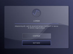 INFO WINDOW |
 CONTROLLERS |
|---|
 PRESET EDITOR |
|---|
 MIDI_SEARCH MODE |
|---|
 MIDI PARAM MODE |
WEBSITE USER INTERFACE_
 |  |
|---|
 HOMEPAGE |  MM1 PAGE |  TECH PORTAL PAGE |
|---|---|---|
 SCHEDULE SESSION |  START SESSION |  SHARING SCREEN SESSION |
 REQUEST SUBMITTED SEND |
MML ICON DESIGN FOR APPLE STORE_
To design the MML ICON, I followed the different phases:
-
Research (inspirations).
-
Setting the design direction (through the use of a design brief and/or a moodboard).
-
Creating 12 design concepts.
-
Refining concepts with the most potential.
-
Choosing the concept that best communicates the client's values and brand message.
-
Presentation the logo proposal to the client.
-
Revising the logo based on feedback.
-
Preparing multiple color and composition variations of the logo.
-
Designing the branding guidelines.
 |  |  |
|---|---|---|
 |  |  |
 |  |  |
 |  | 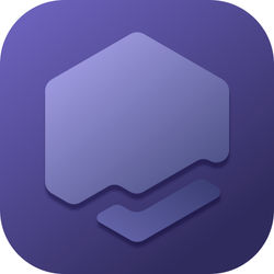 |
The final design is a combination of two concepts. Below you will find the colorful and white version.
 |  |
|---|